Global Power Data
Quiet-luxury identity and a cinematic, interactive website for a boutique infrastructure-finance firm.
A boutique infrastructure-finance firm with no public footprint — and an audience of allocators who read restraint as competence and bravado as nerves.
The ask was deceptively simple: build a credible website. The real mandate was harder — conjure, from a blank slate, the digital presence of a firm that operates a level above its peers, and make a small number of very hard-to-impress people believe it within seconds.
- Client
- Global Power Data, LLC — boutique infrastructure-finance advisory
- Sector
- Clean-energy infrastructure · project finance · data-center power
- Engagement
- Brand identity + website strategy, design & build
- Deliverables
- Positioning · logo & identity system · design system · five-page website · interactive data centerpiece · copy direction · launch engineering
- Stack
- Vite · TypeScript · Lenis · GSAP/ScrollTrigger · inline SVG · self-hosted variable fonts
- Studio
- Axyion — design & build
The presence had to be built, not photographed.
Global Power Data structures the financial architecture that makes community-scale clean-energy infrastructure financeable, compliant, and replicable. The work is sophisticated; the audience — family offices, tax-credit-equity investors, institutional capital — is more so. Their public presence, at the outset, was nonexistent.
Build a credible website, the brief said. The real mandate, once we examined the audience, was to build the brand itself — from a blank slate, entirely through craft.
Four problems shaped every decision.
- No footprint to build on.GPD had no identity, no photography, no proof assets. The site couldn't lean on a brand — it was the brand.
- A skeptical, finance-literate audience.Sophisticated allocators read clutter and bravado as nervousness, and restraint and precision as competence. Anything that looked like it was trying would actively cost credibility.
- An abstract product.GPD doesn't sell a building or a device. It sells structure — the stacking of incentives, the routing of capital, the judgment that makes a project pencil. The hardest thing to show rather than tell.
- Discretion as a requirement.The firm operates with genuine confidentiality. The site had to convey capability and track record without exposing specifics — a hard, designed-in boundary, not an afterthought.
Restraint as the power move.
The defining decision was to reject the category default. The expected route for an energy-finance firm is corporate-tech: blue-and-grey palettes, stock infrastructure photography, a "Schedule a Strategy Session" button. Competent — and instantly forgettable.
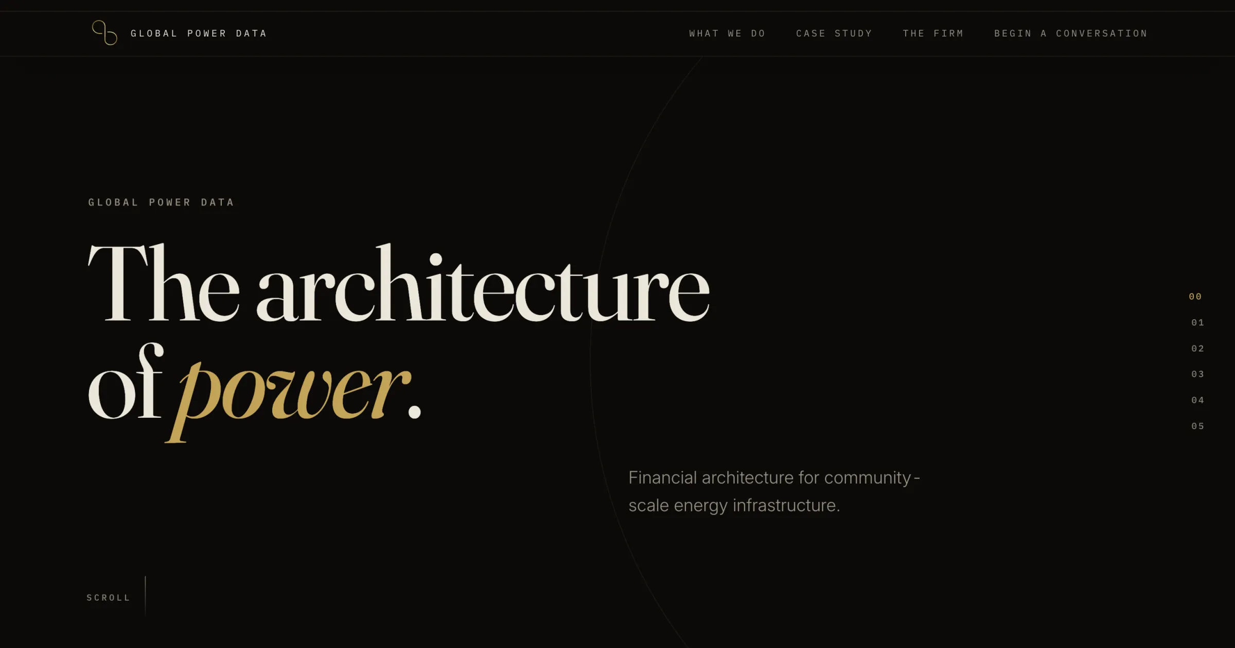
We went the other way: quiet luxury. Near-black, vast space, a single restrained accent, and the conviction that for this audience understatement reads as confidence and permanence. The reference we held throughout: old-money capital that happens to live in the future — couture restraint, instrument-grade precision, nothing loud.
Ambition goes into craft, never into quantity — one signature element, one accent, one idea per screen, executed precisely enough that it could not be mistaken for a template.
The Infinity — a business model drawn as a glyph.
The logo had to do something most marks don't: carry the business model in a single glyph. GPD practices what it calls reciprocal capitalism — capital that returns. Not a one-way line from investor to project and out the door, but a closed loop: capital in, assets built, community anchored, yield returned — and around again. So the mark is an infinity, drawn as one unbroken line of gold that turns back through itself: value that comes back around, with no exit and no end.
It was built for the two tests that actually decide a logo — it holds form at 16px (the favicon) and survives flattened to one color on white (a term sheet). But the mark was never meant to sit still: the same loop becomes the site's line of gold light, and then its centerpiece — an interactive infinity the visitor can grab and spin, each party a node riding the ring. Identity, argument, and experience read as one continuous line rather than three.
Obsidian — one system, held to.
- Palette.Warm near-blacks (never neutral grey), bone text, and a single restrained gold accent that appears only where it earns the eye — the signature line, one key word per headline, key figures, the primary action. 92%+ of every screen is ink and bone.
- Typography.A high-contrast display serif (Fraunces) for stature against a precise monospace (IBM Plex Mono) for labels and data — the tension between humanist serif and engineered mono is the brand voice.
- Motion.One signature easing curve, applied with discipline. Weighted and inevitable, like precision machinery — never bouncy, never decorative.
The Current — the thesis made physical.
The whole site is built around a single idea made physical: the architecture of power. A thin line of gold light enters at the hero (the source), routes down the page as one continuous engineered conductor, threads through every section, and discharges at the contact moment (the output). The space between sections becomes visible conductor rather than empty scroll; navigation continues the line rather than resetting it, so a multipage site reads as one continuous board.
The discipline that kept it from becoming a gimmick: the grammar of a circuit — routing, nodes, source-to-output — never the clip-art of one.
The Infinity Tube — the model you can spin.
The breakthrough of the project. The hardest thing GPD had to convey is that its capital doesn't flow out and disappear — it circulates. Most firms assert that in a sentence. We made it something the visitor turns in their hands: a three-dimensional infinity rendered live in gold ASCII, spinning on its own, that you can drag to spin faster and hover to light up each party on the loop — capital, compliance, community — over the thesis itself: a closed loop, not a line — capital in, assets built, community anchored, yield returned, and back again.
This reframed the entire project. The site had felt like text in the dark; the answer wasn't a louder hero, it was the argument made physical — reciprocal capitalism you can feel move, each party's return seeding the next so value comes back around rather than out the door. The infinity became the idea the rest of the site orbits.
Five pages, one board.
Home, What We Do, Case Study, The Firm, and a private inquiry — with the current persisting across all of them.
- Progressive enhancement as the foundation.Authored as semantic, crawlable HTML first — fully readable and intentional with zero JavaScript — with the cinematic layer (smooth scroll, the current, the infinity tube, reveals) as enhancement on top.
- Engineered to degrade with dignity.A capability-tiering system detects the device and serves a full, a lightweight, or a static version of each effect, downgrading automatically if a device can't hold framerate.
- Accessibility & performance as requirements.Keyboard-operable throughout, visible focus, AA contrast, full prefers-reduced-motion support, self-hosted subset fonts with zero layout shift, transforms-only animation targeting 60fps on mid-range mobile.
The work is in the details.
- Restrained material depth.Raised surfaces read as solid depth lit by a hairline gold edge — material weight without the frosted-glass cliché.
- Damped-follow motion.Scroll-linked effects ease toward their target each frame rather than binding 1:1 to raw input — the source of the site's buttery feel.
- Text that rewards curiosity.Load-bearing words carry a single gold accent; a small set of technical terms reveal plain-language glosses on hover and keyboard focus.
- The inquiry as the payoff.The contact form is reframed as the site's output node: each completion advances the line, and submission closes the circuit in one quiet gold discharge.
- A maker's mark.A discreet, CSS-styled studio signature in the developer console — found only by the curious.
Proof of competence, zero exposure.
The engagement required structuring a credible, public-facing case study while honoring strict confidentiality around prior engagements — conveying capability in general, defensible terms with no sensitive specifics. We treated that as a hard, designed-in boundary from the first artifact to the last.
We also reconciled two visions — a more conventional corporate brief from the client and the distinctive direction the audience actually called for — by holding the creative direction while folding in the substantive, on-strategy elements: services, credibility, the incentive value proposition. The firm's voice stayed intact without diluting the design.
A firm operating a level above its category.
Axyion delivered a launch-ready, five-page brand and website that gives a firm with zero prior public presence a distinctive, ownable identity — one that reads as serious, permanent capital rather than a templated corporate site. It's accessible, performant, and crawlable by construction; confidential throughout; and unified end to end, from a logo that encodes the business model to an interactive centerpiece that makes an abstract financial product tangible in a way prose never could.
Most importantly, it solves the real brief: within seconds, a sophisticated visitor feels they are looking at a firm operating a level above its category — and the path to a private conversation is the quietest, most deliberate action on the page.
Quiet luxury, engineered.
Axyion — brand strategy & positioning · identity & logo system · design system · UX & art direction · interaction & motion design · front-end engineering · copy direction · launch engineering.
Built with Vite, TypeScript, Lenis, GSAP/ScrollTrigger, and hand-authored SVG.