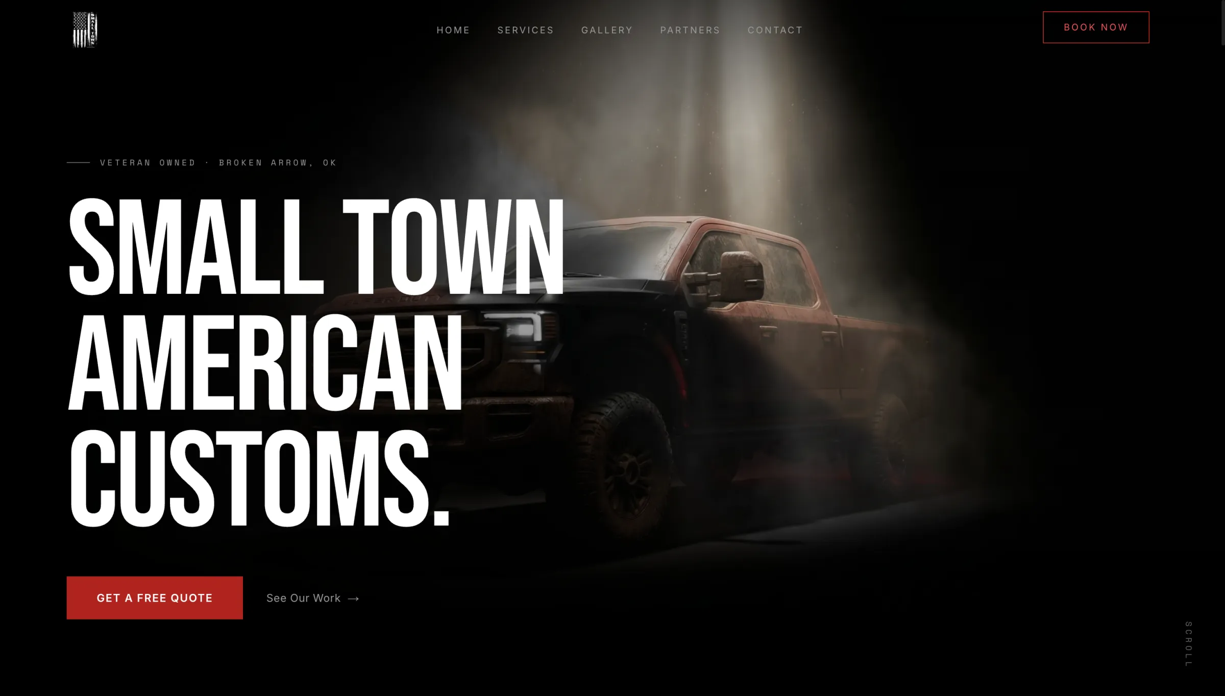
Small Town American Customs
A quiet-luxury identity and a cinematic marketing site for a veteran-owned custom & detailing shop — blue-collar craft delivered with product-launch polish.
A veteran-owned custom & detailing shop with a real following — five-star Google reviews, dealership accounts, and loyalty that runs deep. The surface ask was a website.
The real mandate was harder: give a blue-collar trade — the category where sites read cheapest by default — a presence that out-classes every tint-and-detail shop in the metro, captures leads directly instead of renting them from directories, and never loses the plain-spoken, small-town warmth that earned the reputation in the first place.
- Client
- Small Town American Customs, LLC — veteran-owned vehicle customization & detailing (Broken Arrow, OK · Tulsa metro)
- Sector
- Automotive services / skilled trades — window tint, ceramic coating, spray-in bedliners, full detailing, truck bolt-ons, wraps & PPF
- Engagement
- Brand identity + website design & build + lead-intake integration
- Deliverables
- American-flag wordmark & favicon system · dark cinematic homepage · seven routes incl. statically-generated per-service pages · cursor-driven paint-reveal hero · drag-to-wipe before/after gallery · pinned scroll process reel · veteran-discount & memorial sections · lead form wired to a hosted intake API · Google-review QR loop
- Stack
- Next.js 16 (App Router) · React 19 · TypeScript · Tailwind CSS v4 · GSAP 3.15 + ScrollTrigger · Lenis · Framer Motion 12 · next/font · sharp · Vercel Analytics
- Studio
- Axyion — design & build
A trade that almost never gets a real launch.
Small Town American Customs is a word-of-mouth shop with a genuine following: five-star Google reviews, dealership accounts, a veteran owner, and customers who come back. What they didn't have was a digital presence that matched the quality of the work leaving the bay.
Build a website, the brief said. The real job, once we looked at the category, was to give a skilled trade the kind of presence a product company gets at launch — without ever cheapening the honest, no-fine-print voice that wins the trade.
Four problems shaped every decision.
- A trade that reads cheap by default.The category default for a custom/detail shop is loud and low-rent — checkerboard, flames, neon gradients, clip-art. This one had to feel like precision work while keeping the plain-spoken voice that earns trust.
- Selling a transformation, not a product.The business doesn't sell an object; it sells a before-and-after — the difference between the truck you drop off and the one you drive away. That change is the whole pitch, and it's the hardest thing to put on a page with words.
- Warmth and grief in the same scroll.The brand carries real heart: a standing veteran discount and a tribute to a late co-founder. Both had to live on a high-gloss marketing site without the polish ever cheapening the sentiment.
- Performance under animation weight.A cursor-painted canvas hero, a pinned services rail, a scroll-locked process reel, and a swipeable before/after carousel are exactly the things that wreck mobile load and scroll stability if handled naively.
Luxury restraint, pointed at a loud trade.
The governing decision was to reject the category and borrow the grammar of a luxury studio: near-black canvas, vast negative space, a condensed display face, motion held to one disciplined easing curve — then point all of it at lifted trucks and tint jobs. The homepage says the thesis out loud: "the precision of a luxury studio and the pride of a shop that actually gives a damn."
The one place the restraint bends, it bends on purpose. The name is Small Town American Customs — so the palette is the flag. Against black and bone, the accent alternates red on one section, blue on the next, all the way down the page, keyed off each section's index. Patriotism as a structural rhythm rather than a bald-eagle sticker.
Small-town values, big-league execution — earn the premium in the craft, never in the volume.
The Flag — a mark that says American before a word is read.
The mark is a distressed American-flag wordmark, built as a two-file system so it can hold both contexts a small logo actually lives in: a monochrome flag lockup and a full-color version. In the navigation the two are stacked and cross-faded on hover — the mono flag resolves into color as you point at it — and the same flag becomes the site's favicon and Apple touch icon.
It's a vertical lockup — a portrait flag — and that's a deliberate constraint: it reads as a flag, not a generic horizontal wordmark, and it carries the brand's one non-negotiable idea before a single word is read.
Flag Black — one system, rationed hard.
- Palette.A five-step near-black scale under a four-step bone-to-grey text scale, with the accent a pair swapped section by section — crimson and navy-electric blue. Color is rationed hard: the overwhelming majority of every screen is ink and bone, and red/blue appear only on labels, one accented word per headline, key figures, and the primary action.
- Typography.Bebas Neue — a tall, condensed display face set in caps — carries every headline and does the brand's shouting at whisper volume; Inter carries body; Space Mono carries the technical labels, step numbers, and data ticks. The full type scale is fluid via
clamp(), loaded through next/font with no layout shift. - Motion.One principle: scroll is the timeline. Lenis smooth-scroll feeds GSAP ScrollTrigger; the signature moments are pinned and scrubbed against scroll position rather than time, on one small set of weighted easing tokens — and a global prefers-reduced-motion rule collapses all of it to 0.01ms.
The Paint Reveal — the business model, made physical.
The thing people remember. The hero opens on a dusty, unfinished truck sitting in studio light. As you move the cursor across it, your pointer paints — a feathered brush wipes the grime away in real strokes and the finished custom build emerges underneath, exactly where your mouse has been.
Under the hood it's a hand-built <canvas> compositor: soft radial dabs are stamped into an offscreen alpha mask, spaced evenly along the pointer path so a fast flick never leaves gaps, then the finished-truck image is clipped to that mask so the revealed region carries the brush's feathered edge. It's the entire pitch — you bring us this, you leave with that — made physical in the first three seconds, before the visitor has read a word.
Before / After — a body of work you can play with.
The portfolio problem: "we detail cars" is abstract, and a static grid of shiny trucks proves nothing. The gallery answers it as a swipeable fan of before/after cards. Each card is a real comparison slider — grab the center divider and wipe from the road-worn before to the finished after; swipe or tap anywhere else to fan through the jobs.
The divider owns its own gesture and stops it propagating, so wiping a card never accidentally flings the carousel. It turns the shop's work into something a prospect actually plays with — and every wipe re-proves the transformation at the exact moment of interest.
Seven routes, one top-to-bottom film.
Home, Services, Gallery, Partners, Contact, a held-back Specials, and a dynamic /services/[slug] that statically generates a dedicated page for all seven services — each with its own tagline, pricing, four-step process, and FAQ.
- The homepage as one composition.The home route is a single top-to-bottom film of twelve sections, each wrapped so its red/blue accent is derived from its position — the alternation is structural, not hand-placed, so re-ordering or hiding a section preserves the rhythm.
- Progressive enhancement / crawlability.Content is real server-rendered text first. The pinned process reel renders all four steps in normal, readable flow before hydration, and only then pins them into the scrubbed reel — nothing important depends on JavaScript to be read.
- Graceful degradation.The cursor paint-reveal is a hover affordance, so it's desktop-only by construction — on touch there's no listener, no loop, and the hero simply shows the finished truck. prefers-reduced-motion zeroes every animation, and ScrollTrigger is configured so the mobile URL-bar show/hide never thrashes the pinned scenes mid-scroll.
- Accessibility & performance.The before/after slider is a real
role="slider"with arrow-key control; images negotiate AVIF then WebP through sharp; the hero is the eager LCP while the far-below-fold memorial portrait is lazy-loaded; fonts self-optimize with no layout shift.
The work is in the details.
- Painted, not cross-faded.The hero reveal accumulates soft dabs along the true pointer path and composites through an alpha mask — so the edge feathers like a real brush and follows your hand exactly, rather than a canned wipe.
- Two reels, one scroll.The Process section drives a giant word-reel and a synced title/body reel off a single scroll-progress value, imperatively — no React re-renders — and re-measures once the webfonts swap in so nothing clips.
- The memorial gets no accent and no CTA.The tribute to co-founder David Phillip Badgwell III is deliberately color-neutral and sits between the veteran section and the booking CTA, so the page reads honoring service → remembrance → book as one calm arc.
- A loyalty loop built into the page.A generated Google-review QR anchors a "leave a review, get $30 off" block — turning the site into a machine that compounds the five-star reputation it's trading on.
- A maker's mark.A block-letter Axyion signature is printed to the browser console — found only by the curious.
Polish that amplifies sincerity, never cheapens it.
The identity had to encode American without tipping into kitsch — solved by making the flag a rationed red/blue rhythm against black rather than literal stars-and-stripes decoration.
And the brand's most tender assets — a standing 20% discount for veterans, active-duty military, and first responders, and a co-founder's memorial — had to coexist with a glossy, animated surface. Both were handled with deliberate restraint: no color and no upsell on the tribute; "no hoops, no fine print — just mention it when you book" on the discount. Real customer voices are used verbatim from public Google reviews, with no invented locations or details.
A blue-collar shop that reads a level above its category.
What shipped is a marketing site that reads like a product launch for a trade that almost never gets one: a disciplined near-black system, a condensed studio typeface, a flag-derived red/blue rhythm, and a homepage that performs as you scroll it — a truck you clean with your cursor, a body of work you wipe before-and-after, a process that plays out in a pinned reel.
It captures leads directly through a wired intake form (with a graceful call/text fallback), routes discovery through statically-generated per-service pages and rich share metadata, and compounds the shop's real five-star reputation with a built-in review-for-discount loop. Most importantly it solves the real brief: a blue-collar shop now has a presence that out-classes its entire category — without ever losing the small-town values it was built on.
Small town values, engineered.
Axyion — brand identity · website strategy, design & build · interaction & motion design · front-end engineering · copy direction · lead-intake integration · launch engineering.
Built with Next.js, React, GSAP, and Lenis. Small town values, engineered.