TLDavis Electric & Design
A scroll-choreographed marketing site for a licensed Tulsa master electrician — skilled-trades credibility delivered with product-launch polish.
A word-of-mouth electrician — fifteen-plus years, a master's license, a 4.9★ reputation built one job at a time. The surface ask was a website. The real mandate was to convert reputation into reach.
Take a trade that wins on trust and give it a presence that out-classes every electrician in the market, captures leads directly instead of renting them from directories, and reads equally to Google's crawler and to AI answer engines — without ever looking like it's trying too hard.
- Client
- TLDavis Electric & Design, LLC — founder/master electrician Terry Davis (OK License #00175032)
- Sector
- Skilled trades / home services — residential & commercial electrical contracting (Tulsa, OK metro)
- Engagement
- Brand identity + website design & build + SEO / AI-SEO
- Deliverables
- Outlined wordmark + favicon/OG identity · ~15-page marketing site · scroll-driven homepage · multi-step booking wizard + services quote drawer · programmatic per-city landing pages · cost/guide blog · structured-data + llms.txt discovery layer · lead-intake integration
- Stack
- Next.js 16 (App Router) · React 19 · JavaScript (JSX) · Tailwind CSS 3.4 · GSAP 3.15 + ScrollTrigger · Lenis · Framer Motion 12 · lucide-react
- Studio
- Axyion
Convert reputation into reach.
TLDavis is a word-of-mouth electrical contractor — fifteen-plus years in the trade, a master's license, a 4.9★ reputation built one job at a time. The surface ask was a website.
The real mandate was harder: give a trade that wins on trust a digital presence that out-classes every other electrician in the market, capture leads directly instead of renting them from directories, and be equally legible to Google's crawler and to AI answer engines — all while selling craft without ever looking like it's trying too hard.
Four problems shaped every decision.
- Trade credibility vs. premium feel.Electrician websites read cheap by default. This one had to feel like precision work while keeping the plain-spoken trust that wins the trade — polish that reassures rather than intimidates.
- One operator, many surfaces.A single business's facts — name, address, phone, license, ratings — had to stay perfectly consistent across pages, schema, forms, and footers, with no chance of drift.
- Performance under animation weight.A 97-frame canvas hero and several pinned, scroll-scrubbed scenes are exactly the kind of thing that wrecks mobile load times if handled naively.
- Found by humans and machines.Local SEO and AI-SEO — a structured-data entity graph, an llms.txt — had to be built in from the foundation, without tipping into keyword spam.
Scroll is the showroom.
The governing decision was to treat the homepage not as stacked sections but as a single scroll-driven film. Each block is a pinned scene that plays as you move through it: the hero footage, a horizontal sweep of services, a stacking five-step process, a cinematic project gallery. The copy reframes the trade as precision craft — "surgical" panel upgrades, "craftsmanship in every connection" — language that earns the premium treatment rather than just decorating it.
The bet is simple: a homeowner deciding who to trust inside their walls responds to evident care, and motion-as-storytelling signals that care before a single word is read.
And every animation had to survive being switched off.
The outlined wordmark.
The mark is an outlined TLDavis wordmark (a fixed 762:239 asset) engineered around one constraint: it must work on light and dark without two files. On dark surfaces it shows as a white-and-blue outline as drawn; on the light header a brightness(0) filter drives it to a clean dark outline. One asset, both contexts, legible down to the 26–30px it actually renders at in the nav — a small, disciplined system, which is exactly what a one-color, small-size mark needs.
One accent, earned rarely.
- Palette.A near-white working surface against a deep navy-black, with a tight two-tone electric-blue accent (#1763DE / #1D6FEB) reserved for CTAs, active states, and the occasional hairline. The accent earns its meaning by appearing rarely.
- Typography.Sora — geometric, set heavy (800–900) with tight negative tracking — carries every display and heading; Inter carries body. The scale is fully fluid via clamp() (display ramps 48→128px), loaded through next/font.
- Motion.One principle governs everything: scroll is the timeline. Lenis feeds GSAP ScrollTrigger; nearly every homepage section is pinned and scrubbed against scroll position rather than time — with a global prefers-reduced-motion rule that collapses it all to near-zero.
The frame-sequence hero.
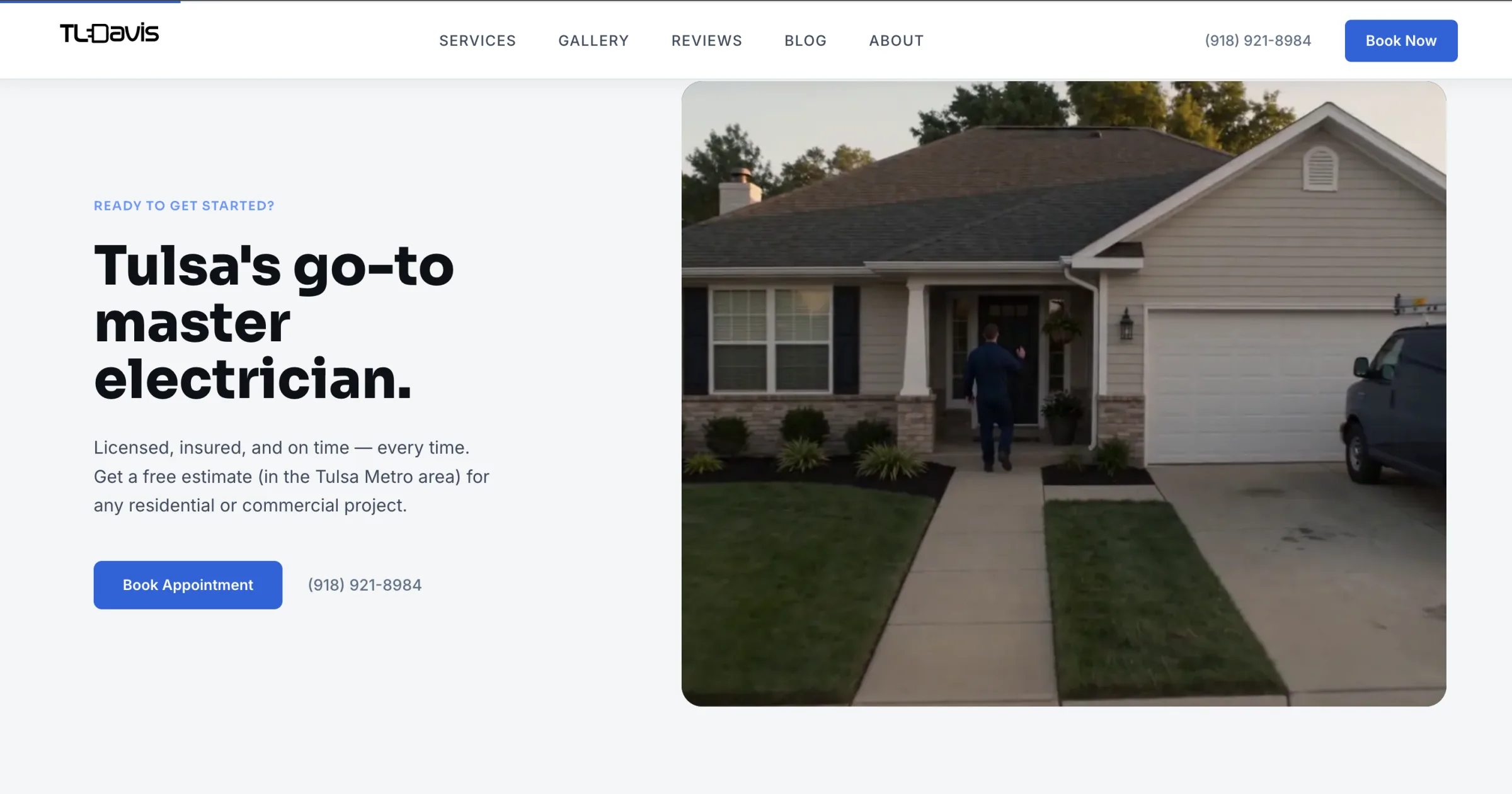
The thing people remember. Ninety-seven WebP frames are pre-decoded into GPU-ready bitmaps and drawn to a 1920×1080 canvas, the playhead scrubbed directly by scroll through a pinned timeline. On desktop the footage doesn't just play — as you scroll, it shrinks and settles into a corner frame while the pitch and CTA fade up in its place. It's keynote-grade scroll choreography, applied with full seriousness to a trade that rarely gets it.
What makes it ship-worthy is the restraint underneath. The first frame is preloaded as the page's main image and painted immediately; the canvas overlays the identical frame so the handoff is invisible; and the remaining frames load only in the browser's idle time, so they never compete with first paint. The spectacle is paid for honestly — the heaviest moment on the site never taxes how fast it loads.
The cinematic gallery.
The portfolio problem: "some electrical jobs" is abstract and unsexy. The solution is a pinned, horizontally-scrubbed rail of project cards — each with a subtle pointer-tracked 3D tilt and a parallax image that resolves from grayscale to color on hover — that click open into a film-grain, vignetted lightbox carrying the project detail and the contractor's license number. It turns a trade's body of work into something a prospect actually wants to browse, and reinforces credibility at the exact moment of interest.
Real text first, the show on top.
- Page structure.Next.js App Router across ~15 routes, plus two dynamic segments: service-areas/[city] statically generates a landing page for all 12 metro cities, and blog/[slug] renders long-form guides. Server components carry content and SEO; interactivity is isolated to 'use client' islands.
- Single source of truth.One module (lib/site.js) holds every business fact and feeds the JSON-LD schema, page metadata, both lead forms, and the footer — so name, address, and entity data physically cannot drift across surfaces.
- Crawlability / progressive enhancement.Every claim is real server-rendered text. The animated hero headline is mirrored by a visually-hidden, full-sentence heading, with the stylized version marked aria-hidden — crawlers and screen readers get the complete headline, humans get the show.
- Search + AI legibility.A JSON-LD @graph ties a LocalBusiness/Electrician node to its founder and the site; per-city pages emit Service schema; reviews emit Review markup; plus breadcrumbs, canonicals, sitemap, robots, a PWA manifest, and a hand-authored llms.txt written to be quotable by AI answer engines.
- Graceful degradation.Every scroll scene is gated behind a ≥1024px check; below that, sections fall back to touch-friendly snap-scroll. Reduced-motion users skip the intro loader and get a fully static site.
- Accessibility.Skip-to-content link, visible focus rings, a focus-trapped mobile menu (Escape-to-close + scroll lock), labeled controls, and off-screen honeypots on the forms.
The work is in the details.
- Invisible load handoff.The eager poster image and the canvas paint the exact same first frame, so the moment the interactive version takes over is imperceptible.
- Idle-time loading.The heavy hero frames load only when the browser is idle and release their memory on teardown, keeping first paint fast.
- Clean animation teardown.GSAP scenes unwind cleanly on navigation, so pinned scroll sections never fight React.
- Two-form lead system.A five-step animated booking wizard and a slide-in quote drawer, both with spam honeypots, a stated "within 2 business hours" promise, and a graceful fallback to a phone number.
- Legal hardening.The manufacturer-logo marquee (Leviton, Lutron, Siemens, Square D) carries a trademark disclaimer — the brands are shown "to identify the equipment we install," and the firm is independent and unaffiliated.
A trades site that reads like a product launch.
The engagement delivers a marketing site that reads like a product launch rather than a trades flyer: a single accent color, a serious typeface, and a homepage that performs as you scroll it — backed by an SEO and AI-SEO foundation (entity graph, programmatic city pages, llms.txt) purpose-built to make a local contractor discoverable by both search engines and AI answer engines. Performance was treated as a first-class constraint, with the heaviest visual moment — the 97-frame hero — deliberately deferred so it never taxes first paint.
The result gives a trusted, word-of-mouth operator a presence that out-classes the category and captures leads directly, instead of renting them from a directory.
Skilled-trades credibility, engineered.
Axyion — brand identity · website strategy, design & build · interaction & motion · SEO / AI-SEO foundation · lead-intake integration.
Built with Next.js, React, GSAP, and Lenis.